
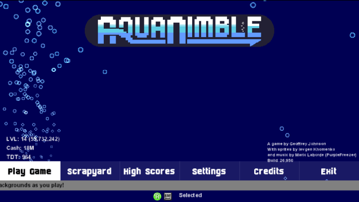
After looking at AquaNimble’s welcome screen for over a year, I have changed it. It was once a clump of menu items like every other menu, but now it has a horizontal layout to match the tip ticker below. A few menu items were removed and now there are two tiers. This design choice should let me put something between the logo and the menu items.
Menu Tiers
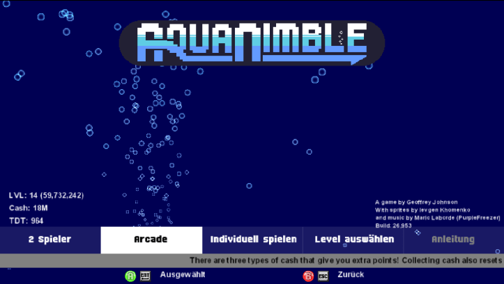
To keep the menu more efficient and less overwhelming, there are two tiers and a few less menu items. The main tier has Play / Settings / Scrapyard (which should just be renamed Shipyard) / High Scores / Exit. Then the play tier has the amount of players / Arcade / Custom / Level Select / Instructions. To make the menu more interactive, bubbles come out of the selected item.
Icon Invasion
There are now keyboard and button icons for all menus to instruct people how to use the menu. It should be self explanatory, but since I had made it for the vessel selection, why not include it in the other menus? Its just another frill that makes the game look like a polished product.
Mouse Functionality still Offline
I also made an attempt to improve using the mouse to select menu items. This function works fine, but the problem is scrolling menus will scroll by what item is highlighted. For the time being, the mouse functionality has been removed until I improve the issue. The only thing now that I can think of to quell the problem would be forcing the selected menu item to be beyond the screen before it scrolls. I will get to that some other time.
You can still left click to use the selected menu item and right click to go back. I have added functionality to use the mouse wheel left and right by holding shift.
Languages of All Shapes and Sizes
The text in the game is dynamic and is read from language files with the exception of a few. Dynamic text made another issue where some languages have more words than others, so I made a system to compensate and reduce the font size accordingly. That way nothing will get cut off.
An Excess of Screenshots and a Need for Backgrounds
After having nothing along with the logo for so long, the menus now have backgrounds taken from the screenshots directory. Its simple, have a screenshot? Then it can be shown as a background. The backgrounds are turned aqua and half translucent to give a watery feel that is perhaps better than any other watery feel in the game. The image then pans from the bottom left to the top right.. At first it was bottom right to top left, but I realized I had plenty of screenshots using debug and the heads up display itself. This movement pattern avoids both.
On a side note, I like doing these blogs because I find new issues with AquaNimble as I write these and try to gather interesting screenshots for something mundane.
